Name: Tasima AS
Business: Tasima AS is an electrical company with 1 employer performing in electrical engineering jobs. The employer has accepted work around the world and in Norway and it has mostly been projects to complete, not long term employment. The company was founded in 2012 and has since then been stable in the market and kept a good reputation. Even though the employer is an electrical engineer he has an aim for the company to expand into a holding company.
Profile: Professional, efficient, accurate, quality, safety, flexible, experienced, after sale market. Vision: In the future the company is looking to expand into something more than only electrical company, but to include other branches and turn into a holding company for f.ex. property, offices, parking and entrepreneur.
Audience: Public companies, private customers, electrical/instrument/automation projects onshore/offshore.
Justification for the choice of customer: I reached out to this company because I knew it was a small startup company but in the future would expand into something more. As I would do this as my semester project the client would not pay and this suited the company in the situation it is in now. The client hasn’t yet taken the step to expand, but will do so in the future. I offered my competence and they accepted what I had to offer. They would like to get a graphic designer to create products that can represent a professional face of the company so that the audience can get a good impression and choose this company to perform on their projects/jobs.
Troubleshooting (Products):
– Logo
– Brand style guide
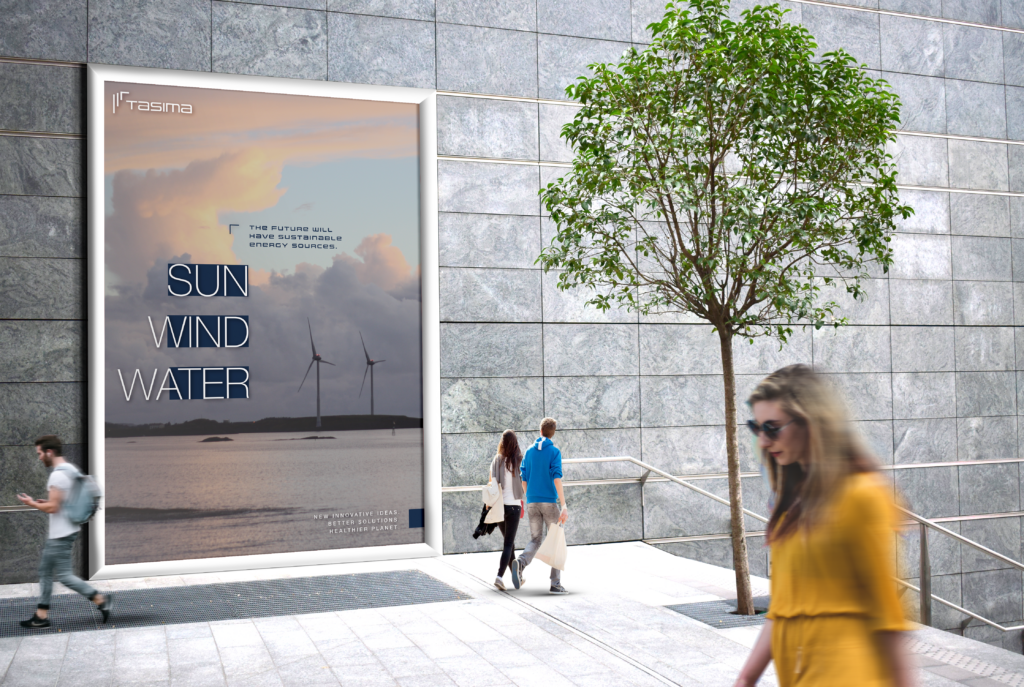
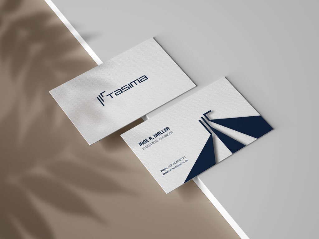
– Stationary (Business card, envelopes, memory stick) – Poster
– Brochure (2 pages)
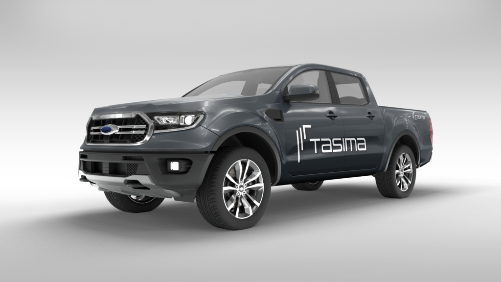
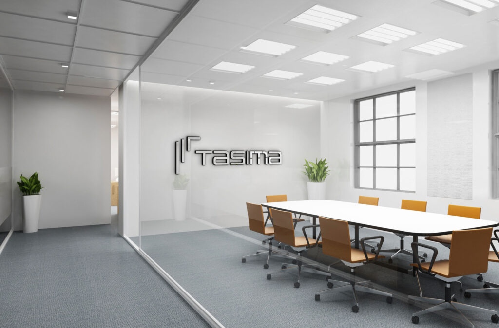
– Logo for print for 1 wall sign, clothing and pickup car.
Scope of each product:
– Logo: professional, with abstract icon.
– Brand style guide: Representation of the logo, stationary, poster, brochure and example of printed versions for wall sign, clothing and pickup car.
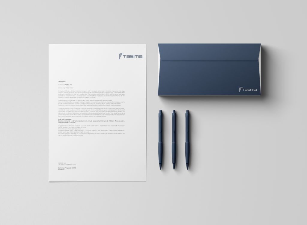
– Stationary: Business card, envelopes/documents and memory stick
– Poster: Finished 594mm x 841mm (A1 size) Artwork: + 6mm w/bleed
– Brochure: 2 pages, including photo’s and logo
– Logo for print for 1 wall sign: Made for later use on office building. For clothing: For work clothing, t-shirt, company’s football team. Pickup car: Company car with logo presented on it.
Brief style statement:
– Simple, minimalist, wordmark w/abstract icon, include purpose behind name (3 children -Thomas Andre, Silje and Marthe = TASIMA).
– Suggestion from client: T to cover the top of the whole word «Tasima». Maybe three lines underneath the word as well (to represent the meaning behind the name)
– Innovative color choice (perhaps green).
– Suggestion for the lines:
– Green (dominant – the future is green – sun, wind water.)
– Grey (medium relevance – pellets, wood, gas)
– Black (least dominant – oil, coal)
– Not to be defined by one thing (ex. only electrical engineering) so that it doesn’t get assumed as one branch, but can be used in future as holding company.